Visualizing public transport
An exploration of visualizing large datasets
Sometime in 2018, I came across the Python library called datashader. It has the aim of creating scatterplots of large datasets in a performant but still meaningful way. When coming across some new tool, I like to incorporate it in some small demo project, as I found that hands-on learning works best for me. That is what I did with datashader.
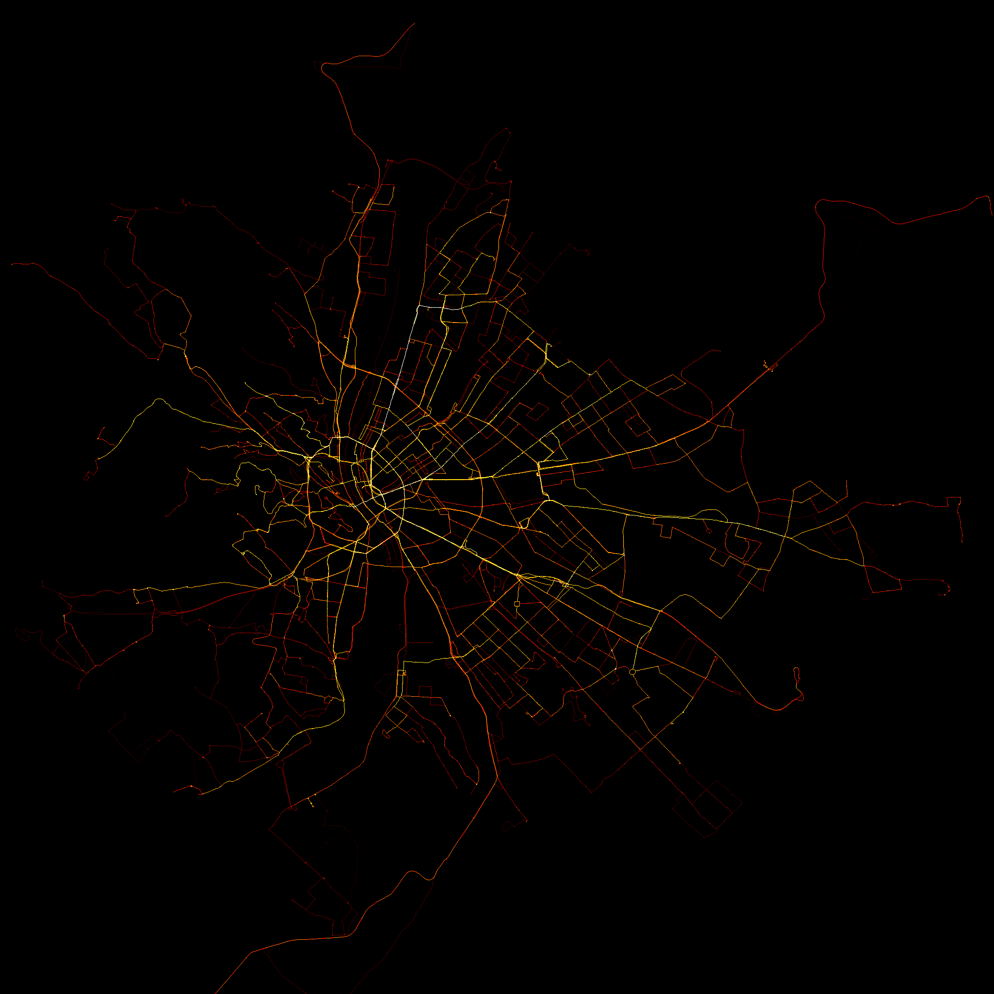
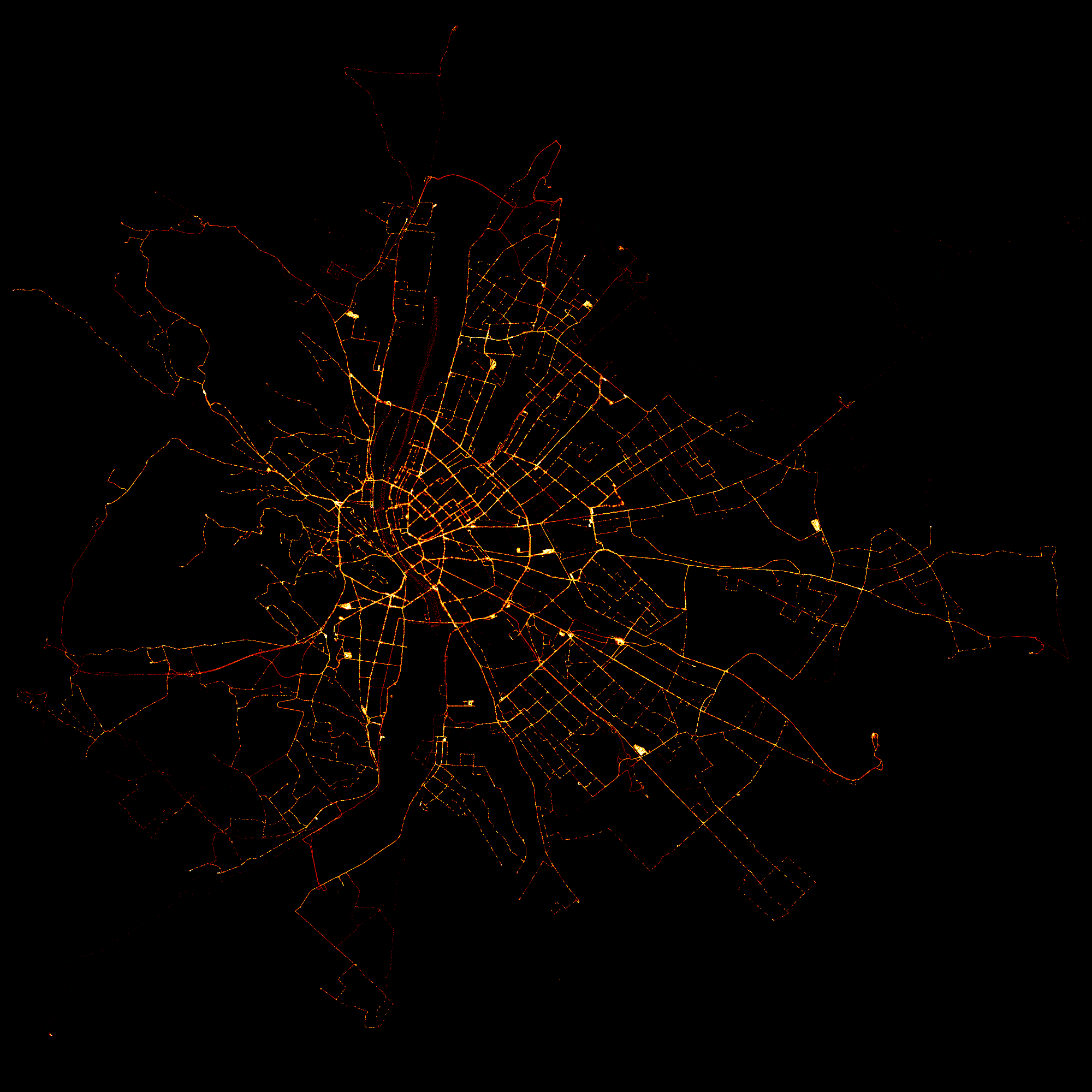
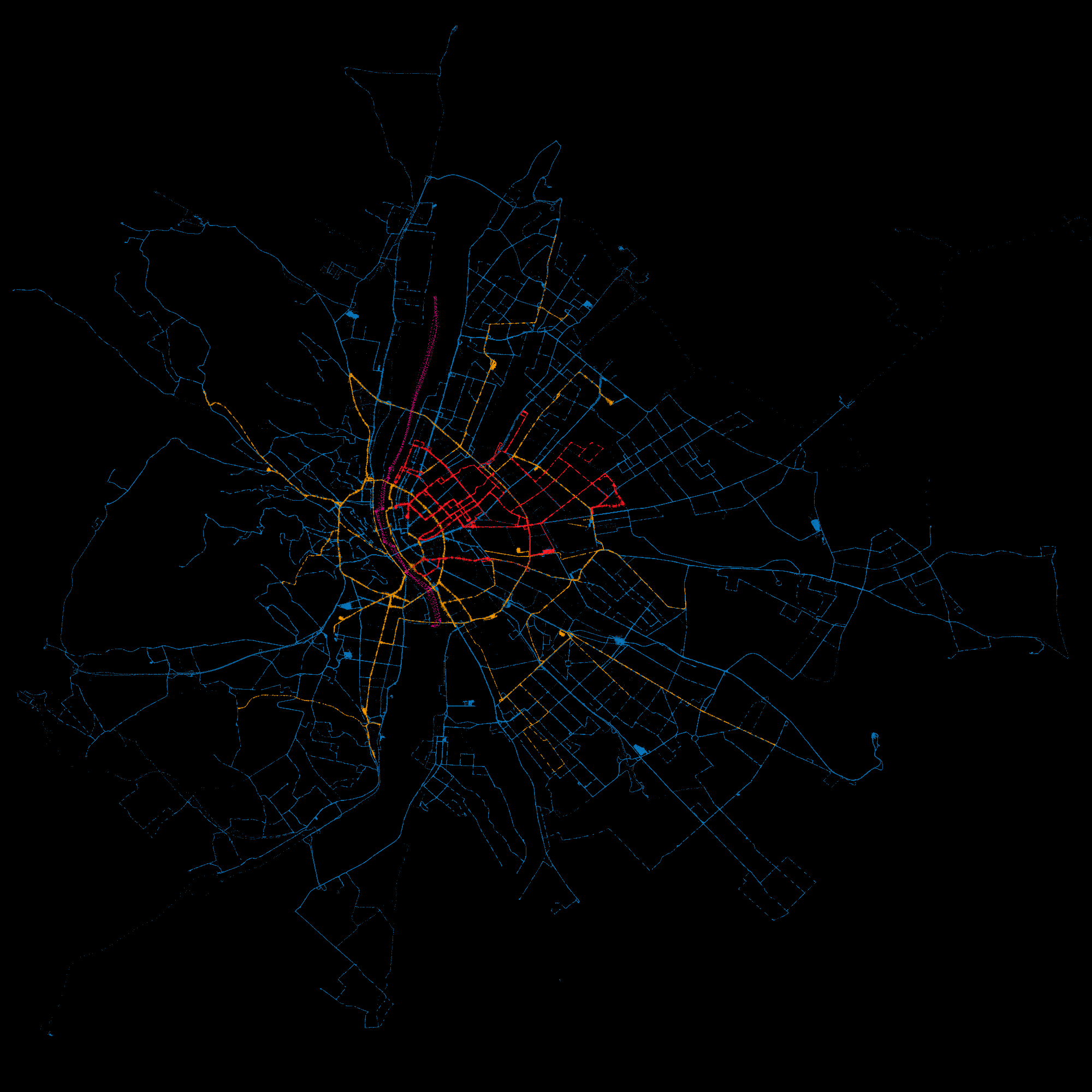
The idea is simple: the Centre for Budapest Transport (BKK) provides (or, at least, used to provide) an API for accessing the location of all of its vehicles in real time. All I did was to query the location of all vehicles at a regular interval, for 24 hours. After that, I created a scatterplot of the recorded locations. I have also overlaid this scatterplot on an interactive, zoomable map of the city.
I learned a lot while doing this project. If you are interested, head over to my blog post about it where I write about the process in more detail. Also, I think the resulting plots are quite nice. You can take a look at them below.


