A snapshot of economics, part 2 - visualizing the network
The last article focused on collecting data on the economics literature (from a legal and a technical standpoint). Here is a short primer if you have not read it.
Every article published in the field of economics is assigned a few (usually 2-5) JEL (Journal of Economic Literature) codes by the authors which define the subfields it belongs to. This system of classification is hierarchical: the codes consist of a letter (main category) followed by two numbers. You can find the list here.
As a project for a network science cource, Olena Chystiakova and I attempted to analyze, visualize and model the network of these classifications. We use the number of articles containing a pair of JEL codes as the measure of the strength of association between the two subfields. In order to do this, we have downloaded the JEL codes (and some other metadata) of every article published in the field of economics in 2014 that could be found in the Econlit database. This article will deal with the transformation and the visualization of this data.
Projection to JEL codes
We will start by processing a data into network format. Let us import it into a pandas.DataFrame and see how the downloaded database looks!
import sqlite3
import pandas as pd

conn = sqlite3.connect("data/full_database.db")
articles_wide = pd.read_sql("SELECT an, jel FROM articles", conn)
conn.close()
articles_wide.head()
| an | jel |
|---|---|
| 1419951 | B31; G30; M40 |
| 1419952 | G34; L25; M12; M52 |
| 1419953 | D24; G31; L14; L23; L24; L25; M41 |
| 1419954 | D82; G12; G32; L25; M41 |
| 1419955 | G32; G34; G38; L25; M42; M48 |
For every article (identified by an article number, an) we have all of the JEL codes it is associated with. Unfortunately, the JEL codes are stored as a string delimited by semicolons. In order to turn it into a proper edgelist between article and JEL code nodes, it has to be transformed it so that each row of the jel column contains exactly one JEL code.
articles_series = (articles_wide[articles_wide["jel"] != ""]
                   .apply(lambda row: [(row.an, j) for j in row.jel.split("; ")], axis=1))
articles_list = []
for edge in articles_series:
    articles_list.extend(edge)

articles_long = pd.DataFrame(articles_list, columns=["an", "jel"])
articles_long.head()
| an | jel |
|---|---|
| 1419951 | B31 |
| 1419951 | G30 |
| 1419951 | M40 |
| 1419952 | G34 |
| 1419952 | L25 |
Now we that we have the bipartite graph (i.e. a graph whose nodes areseparable into two groups, with edges only connecting nodes from different groups), we can use NetworkX to project it to the nodes representing JEL codes, thereby producing an undirected weighed graph where the nodes are the JEL codes.
First we create the bipartite graph by creating an empty node, adding the article nodes, adding the JEL nodes, and finally adding the edges.
import networkx as nx

bipart_graph = nx.Graph()
bipart_graph.add_nodes_from(articles_long.an.unique(), bipart=0)
bipart_graph.add_nodes_from(articles_long.jel.unique(), bipart=1)
bipart_graph.add_edges_from(articles_long.apply(lambda row: (row.an, row.jel), axis=1))
Then we can use the weighted_projected_graph function from the networkx.projection module to project the bipartite graph to one set of nodes, with the weight of nodes representing the number of articles through which two JEL codes are connected. Then, as we are not interested in disconnected nodes, we select the giant component of the projection.
jel_graph = nx.bipartite.projection.weighted_projected_graph(bipart_graph,
                                                             articles_long.jel.unique())
jel_graph_giant = max(nx.connected_component_subgraphs(jel_graph), key=len)
Visualization preliminaries
This far the graph is just a set of nodes and a set of edges connecting them. In order to plot it, we need to assign (x, y) coordinates to each node. This can be done by using functions from the networkx.drawing module. In this example, a force-directed algorithm is used, which places strongly connected nodes (measured by the edge weight) closer to each other.
fr_layout = nx.drawing.fruchterman_reingold_layout(jel_graph_giant, k=2, weight="weight")
Now we need to convert the networkx graph to a format that can be handled by holoviews and datashader: a pandas.DataFramewith the columns containing the various attributes of the nodes [name, x-coordinate, y-coordinate, JEL category, and weighed degree (the number of edges connected to a node, or in the weighed case, the sum of their weights)].
node_df = (pd.DataFrame.from_dict(fr_layout, orient='index', columns=["x", "y"])
           .reset_index()
           .rename(columns={'index': 'name'}))
node_df["category"] = node_df["name"].str.slice(0, 1).astype("category")
degree_df = pd.DataFrame(list(jel_graph_giant.degree(weight="weight")), columns=["name", "degree"]).set_index("name")
node_df = node_df.merge(degree_df, left_on="name", right_index=True)
node_df.head()
| name | x | y | category | degree |
|---|---|---|---|---|
| K33 | -0.335445 | 0.084594 | K | 589 |
| C81 | -0.606666 | 0.115445 | C | 272 |
| D45 | 0.664908 | 0.800432 | D | 152 |
| I18 | 0.158935 | -0.143668 | I | 2931 |
| O55 | -0.951587 | -0.080761 | O | 6 |
Now we need to do the same with edges. As we will use functions from the datashader.bundling module later on, we need a very specific format (holoviews would be more flexible): a pandas.DataFrame having the columns source and target, indicating the index of the nodes that the edge connects, and optionally a column of weights. It may have more columns, but it needs to have source and target at a minimum.
edge_df_names = nx.to_pandas_edgelist(jel_graph_giant).rename(columns={"source": "source_name", "target": "target_name"})
name_index_key = node_df["name"].reset_index().set_index("name")
edge_df = (edge_df_names.merge(name_index_key.rename(columns={"index": "source"}), left_on='source_name', right_index=True)
                        .merge(name_index_key.rename(columns={"index": "target"}), left_on='target_name', right_index=True))
edge_df.head()
| source_name | target_name | weight | source | target |
|---|---|---|---|---|
| K33 | G34 | 3 | 0 | 305 |
| D45 | G34 | 1 | 2 | 305 |
| I18 | G34 | 4 | 3 | 305 |
| O34 | G34 | 5 | 6 | 305 |
| I25 | G34 | 1 | 7 | 305 |
Visualizing the network
We will use holoviews to annotate our data, complemented by datashader to properly visualize the many overlapping edges. We also utilize the bokeh extension of holoviews so that the resulting graphs will be interactive (supporting panning, zooming and tooltips). That said, they will be fully interactive if a python kernel is running (in this case datashader recomputes the shading with each change of view) and somewhat interactive if they are exported as Javascript (the edges will be a fixed image, so no rerendering on zooming, but tooltips and panning would work properly). On this blog however, the plots will be static images.
import numpy as np
import holoviews as hv
from holoviews.operation.datashader import datashade, bundle_graph
hv.extension("bokeh")
We start by creating a Nodes object, which is a representation of the graph’s nodes. The key dimensions will be the coordinates and the indices, and we also add the JEL category and the log-degree of the node as value dimensions. Then, we create a Graph object by using the previously created nodes and adding two additional key dimensions: the source and target node of each edge. We will also use the edge weight as a value dimension.
There will be two versions of the graph:
-
graph, where each edge is drawn straight from source to target, and -
bundled_graph, where edges closed to each other are bundled together.
colors = hv.Cycle('Category20').values

nodes = hv.Nodes((node_df.x, node_df.y, node_df.index, node_df.category, np.log(node_df.degree) / 15),
                 vdims=["Category", "log_degree"])

graph = hv.Graph(((edge_df.source, edge_df.target, edge_df.weight), nodes),
                 vdims=["Weight"], label='A snapshot of economics')
graph = graph.redim.range(x=(-1.05, 1.4), y=(-1.2, 1.2)).options(cmap=colors)

bundled_graph = bundle_graph(graph, weight="Weight")
Everything is set: our data is annotated, so we just need to print it to plot it. A slight twist is that we plot the nodes and the edges separately, as we do not want to datashade the former.
We can use the %%opts ipython magic to set some display properties, and also to map the categories to node colors and log-degrees to node sizes. Then we utilize the datashade function from the holoviews.operation.datashader module to map the edges to pixels according to density, and use the * operator to place the two plots on top of each other.
%%opts Nodes [color_index='Category' size_index='log_degree' width=600 height=600 xaxis=None yaxis=None bgcolor="black" tools=["hover"]] (cmap=colors alpha=0.85)
%%opts Graph [width=600 height=600 xaxis=None yaxis=None bgcolor="black" tools=["hover"]]
datashade(graph, normalization='eq_hist', cmap='cyan', width=600, height=600) * graph.nodes
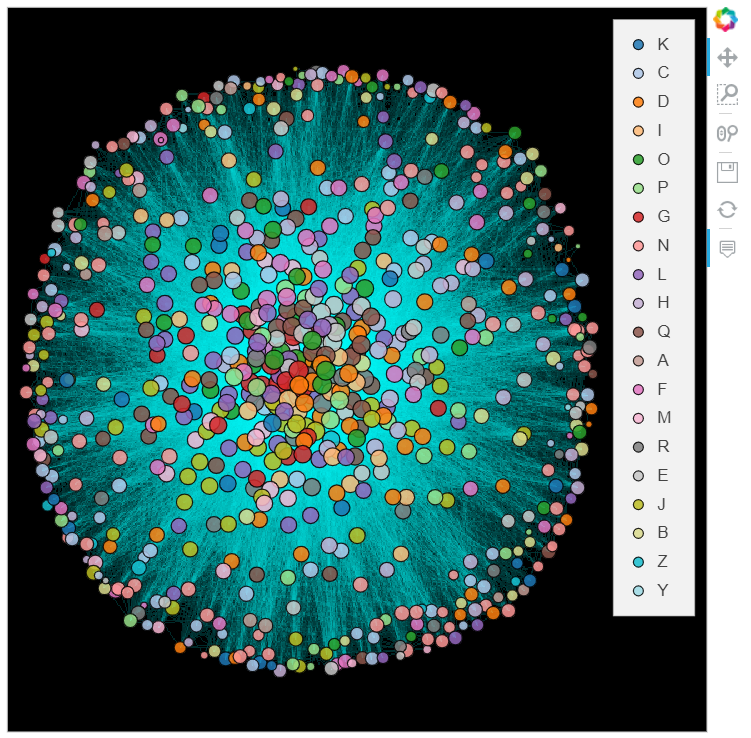
%%opts Nodes [color_index='Category' size_index='log_degree' width=600 height=600 xaxis=None yaxis=None bgcolor="black" tools=["hover"]] (cmap=colors alpha=0.85)
%%opts Graph [width=600 height=600 xaxis=None yaxis=None bgcolor="black" tools=["hover"]]
datashade(bundled_graph, normalization='eq_hist', cmap='cyan', width=600, height=600) * bundled_graph.nodes
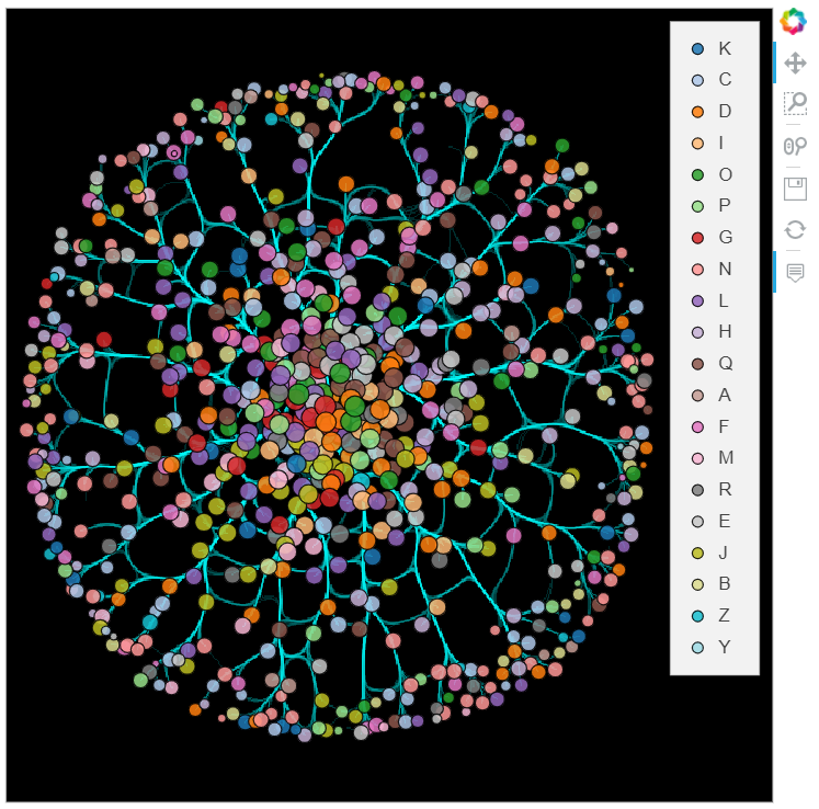
Not a bad start, but not perfect either. You might have noticed, that we did not use the edge weights, therefore the edge shades represent the number of edges, not the sum of their weights. Unfortunately, shading based on the sum of weights is not as easy as I would like it to be. The problem is that the edgepathsattribute of a Graph object (which is an EdgePath object itself) does not contain the weight. As the datashade function gets this object for shading the nodes, it cannot see the weights, and as a result, supplying datashader.sum(Weight) as an aggregation function will not work.
We can solve this by creating an EdgePath-like object ourselves, which will nevertheless have a Weight value dimension, and supplying that to datashade. We can use the connect_edges and hammer_bundle functions from the datashader.bundling module to create the dataframes containing the edge path, separated by NaN rows so that different edges will not be connected. If they are given a weight attribute, the resulting pandas.DataFrame will also contain a weight column. Then a Path object can be created having the coordinates of the paths as key dimensions and the weights as a value dimension. Finally, this Path object can be datashaded, and the sum of weights can be used as an aggregator function. The nodes are then added to the plot just like before.
import datashader as ds
from datashader.bundling import hammer_bundle, connect_edges

conn_edge_df = connect_edges(node_df, edge_df, weight="weight")
edge_paths = hv.Path([conn_edge_df.values], vdims="Weight")

bundled_edge_df = hammer_bundle(node_df, edge_df, weight="weight")
bundled_paths = hv.Path([bundled_edge_df.values], vdims="Weight")
%%opts Nodes [color_index='Category' size_index='log_degree' width=600 height=600 xaxis=None yaxis=None bgcolor="black" tools=["hover"]] (cmap=colors alpha=0.85)
%%opts Graph [width=600 height=600 xaxis=None yaxis=None bgcolor="black" tools=["hover"]]
datashade(edge_paths, normalization='eq_hist', cmap='cyan', width=600, height=600, aggregator=ds.sum('Weight')) *\
    bundled_graph.nodes
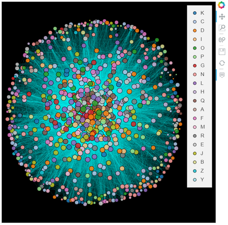
%%opts Nodes [color_index='Category' size_index='log_degree' width=600 height=600 xaxis=None yaxis=None bgcolor="black" tools=["hover"]] (cmap=colors alpha=0.85)
%%opts Graph [width=600 height=600 xaxis=None yaxis=None bgcolor="black" tools=["hover"]]
datashade(bundled_paths, normalization='eq_hist', cmap='cyan', width=600, height=600, aggregator=ds.sum('Weight')) *\
    bundled_graph.nodes
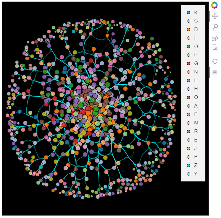
Further refinements
Almost there. The last detail would be to color the edges using the colors of the nodes they connect (ideally, the edge colors would be gradients between the source and target node colors). Unfortunately, there are multiple issues with this.
First, the dataframes resulting from the connect_edges and hammer_bundle functions do not have an id by default, so joining them to node or edge attributes is not straightforward. The two functions have an include_edge_id argument, which sounds like it should solve this, but setting it to either True or the name of a column crashes the interpreter (at least in this example). Might be a bug. Nevertheless, one could certainly write a custom connect_edges function, and probably joining edge attributes to the result of hammer_bundle is also feasible, but it would be an awful lot of bother.
Another problem is that there is no sum_cat aggregation function in datashader. There is count_cat, but then we lose the weight information. We could also shade the categories separately and stack them on top of each other, but then the stacking order would matter a lot (correction: by using the how='add' argument it would not). Neither of these options is optimal.
What we did back then was exporting the network to a graphml file, and loading it into Gephi (a graph visualization tool) to make the visualization. It is a WYSIWYG-type program, so we could easily fiddle around with various parameters until we got the desired result. I think the final product is pretty good. You can find an svg version here.
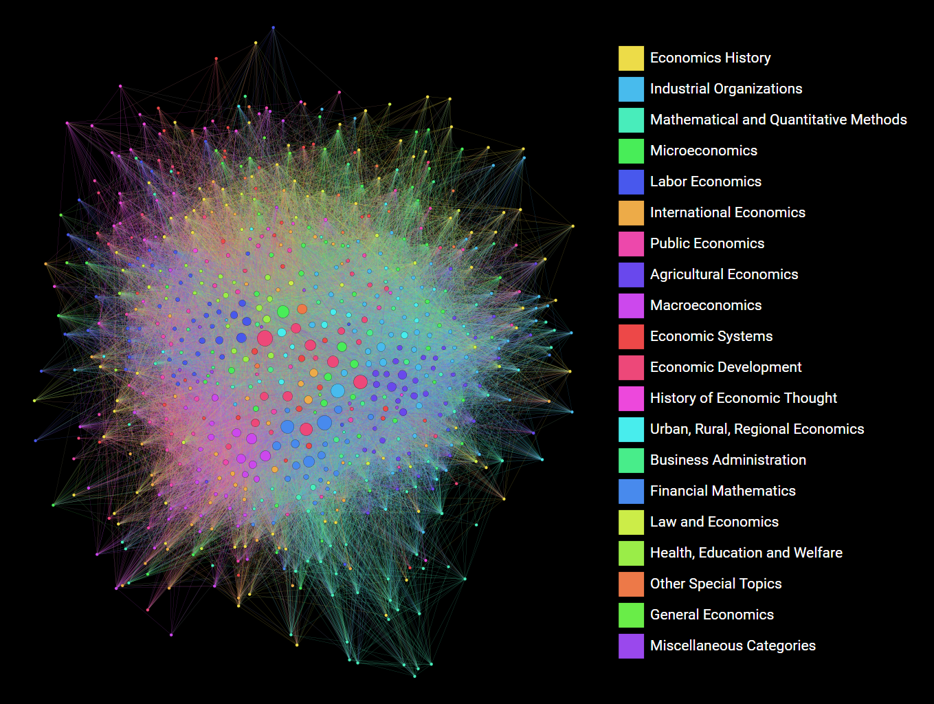
While the fact that the final chapter in a Python dataviz article is to use another software for better results might seem a litle dispiriting at first, i think the main takaway is this: use the right tool for the job. For visualizing this moderate-sized network, the right tool seems to be a dedicated graph visualization software.
We managed to create pretty good graphs using holoviews and datashader, but for the reasons listed above, these packages are not on par with Gephi yet, as far as graph visualization goes. But it is not neccesssarily a bad thing. For one, the former libraries have a much broader scope than just graphs and networks, so it is not surprising that they cannot compete with a specialist. Also, they may improve a lot in the future, as they are both relatively new. And you have to remember that it was a moderate-sized graph. For one with hundreds of thousands of nodes and millions of nodes, datashading might be the only reasonable option, and may come up on top even with its current limitations.
Hope you enjoyed this write-up. The concluding part of this series will deal with modelling this network.