Visualizing public transport
Plotting stuff is fun. Plotting stuff on top of maps is even more fun. Even better, using modern Python visualizaton libraries, plotting on top of maps is simple, too.
Plotting large datasets is also a lot of fun, but sadly, it is difficult. One has to fiddle with sampling, opacity, and various parameters to visualize datasets over a million points. Isn’t there a better way?
As it turns out, there is. The extraordinary datashader library made by the people at Anaconda Inc might be a game changer for meaningfully visualizing large datasets. This write up is inspired by the NYC taxi example at the wonderful PyViz website.
On one hand, I did this project to familiarize myself with the datashader library, and on the other hand, I wanted to make use of the plenty of data published by the Centre for Budapest Transport (BKK). The next few paragraphs can be viewed as a tutorial on making spatial plots with datashader, or as an (admittedly superficial) description of Budapest’s public transport system.
First approach: using GTFS data

The Centre for Budapest Transport (BKK) makes its timetables available in the widely used and public GTFS format (General Transit Feed Specification) to make creating public transport related applications easy for developers. However, this very same data can also be used to analyze and visualize the public transport system of Budapest.
The GTFS format is a simple database: a zip files containing a set of comma-separated csv files which can be joined to each other based on some key columns. Let us start by downloading the most current timetable and looking at its contents.
import requests
import shutil
import os
import zipfile

req = requests.get('http://www.bkk.hu/gtfs/budapest_gtfs.zip', stream=True)
with open('budapest_gtfs.zip', 'wb') as file:
    shutil.copyfileobj(req.raw, file)

if not os.path.exists('./data'):
    os.mkdir('./data')

with zipfile.ZipFile('budapest_gtfs.zip', 'r') as file:
    file.extractall('./data')

os.listdir('./data')
['agency.txt',
 'calendar_dates.txt',
 'feed_info.txt',
 'pathways.txt',
 'routes.txt',
 'shapes.txt',
 'stops.txt',
 'stop_times.txt',
 'trips.txt']
It is possible that you will not be able to download the above file if you are outside of Hungary. You can then either try a VPN, or get the version that I downloaded on 14th October 2018 from here (Google Drive link, might not be up indefinitely).
The files that are going to be relevant for us in order to create a map are:
-
trips.txtwhich contained every scheduled trip line-by-line and -
shapes.txtwhich is a spatial description of each route (longitude and latitude information).
The two tables are linked by shape_id, which is the primary key of the shapes table. Let’s load the files and look at the data!
import pandas as pd

trips = pd.read_csv('data/trips.txt', low_memory=False)
shapes = pd.read_csv('data/shapes.txt', low_memory=False)
trips.head()
| route_id | trip_id | service_id | … | shape_id | … | boarding_door |
|---|---|---|---|---|---|---|
| 8140 | B0571610 | B05716AHPKP-0011 | … | Y701 | … | 2.0 |
| 8140 | B0571611 | B05716AHPKP-0011 | … | Y702 | … | 2.0 |
| 8140 | B0571612 | B05716AHPKP-0011 | … | Y701 | … | 2.0 |
| 8140 | B0571613 | B05716AHPKP-0011 | … | Y702 | … | 2.0 |
| 8140 | B0571614 | B05716AHPKP-0011 | … | Y701 | … | 2.0 |
shapes.head()
| shape_id | shape_pt_sequence | shape_pt_lat | shape_pt_lon | shape_dist_traveled |
|---|---|---|---|---|
| 0285 | 100001 | 47.519630 | 19.148313 | 0.0 |
| 0285 | 100002 | 47.519657 | 19.148286 | 4.0 |
| 0285 | 100003 | 47.519839 | 19.148638 | 35.0 |
| 0285 | 100004 | 47.520584 | 19.150246 | 182.0 |
| 0285 | 100005 | 47.520674 | 19.150432 | 199.0 |
Looks simple enough. If we would like to plot the trafic of the transit network, we just have to aggregate the trips table by counting the number of lines by shape_id, join the two tables by shape_id, and make a line plot.
num_trips_by_shape = trips.groupby('shape_id').aggregate({'route_id': 'count'}).reset_index()
num_trips_by_shape.rename({'route_id': 'trip_count'}, axis='columns', inplace=True)

shapes_with_nums = shapes.merge(num_trips_by_shape, on='shape_id')
shapes_with_nums.head()
| shape_id | shape_pt_sequence | shape_pt_lat | shape_pt_lon | shape_dist_traveled | trip_count |
|---|---|---|---|---|---|
| 0285 | 100001 | 47.519630 | 19.148313 | 0.0 | 6 |
| 0285 | 100002 | 47.519657 | 19.148286 | 4.0 | 6 |
| 0285 | 100003 | 47.519839 | 19.148638 | 35.0 | 6 |
| 0285 | 100004 | 47.520584 | 19.150246 | 182.0 | 6 |
| 0285 | 100005 | 47.520674 | 19.150432 | 199.0 | 6 |
We are almost there, only two minor details are missing.
First, if we would like to use map tiles as a background for our plots, we will have to convert the latitute-longitude data to Web-Mercator coordinates, as Bokeh can only handle the latter. Fortunately, there is a handy function in the datashader package to do just this.
The second issue is that if we were to make a line plot of the above database as it is, the last point of each shape would be connected to the first point of the next shape. We can avoid this by inserting a row of NaNs between each shape.
The next block deals with these problems.
from datashader.utils import lnglat_to_meters
import numpy as np

shapes_with_nums['coord_x'], shapes_with_nums['coord_y'] = \
    lnglat_to_meters(shapes_with_nums['shape_pt_lon'], shapes_with_nums['shape_pt_lat'])

def split_df_by(df, byvar):
    df_parts = []
    for level, df_part in df.groupby(byvar):
        empty = pd.DataFrame([[level if colname == byvar else np.NaN for colname in df.columns]],
                             columns=df.columns)
        df_parts.append(df_part.append(empty))
    return pd.concat(df_parts)

sep_shapes = split_df_by(shapes_with_nums, 'shape_id')
Everything is set, now on to the plot!
We will do it in four steps:
- We create a bokeh figure, and hide grids and axes for aesthetic reasons.
- Next, we add map tiles to this figure using
bokeh’sWMTSTileSourcefunction and an XYZ map source. - Then we define a callback function that wraps up
datashaderplotting steps, and returns a datashaded image given plot ranges and figure size. These steps are the following:- Create a canvas with the given ranges (in coordinates) and size (in pixels)
- Plot the lines and aggregate to the pixel level. Here we use the sum of trip counts, as we are interested in the number of vehicles per day at a given location.
- Then we transform the aggregates into an image by shading according to a colormap and a link function (in this case, colors will mean percentiles as a result of using
'eq_hist').
- Finally, we use the
InteractiveImagefunction fromdatashaderto link the plot and the data shading steps, and display the figure.
import bokeh.plotting as bp
from bokeh.models.tiles import WMTSTileSource
import datashader as ds
import datashader.transfer_functions as tf
from datashader.bokeh_ext import InteractiveImage
from datashader.utils import export_image
import colorcet as cc

bp.output_notebook()

x_range=(2.101e6, 2.155e6)
y_range=(5.994e6, 6.052e6)

if not os.path.exists('./img'):
    os.mkdir('./img')
p = bp.figure(tools='pan,wheel_zoom,reset',
              plot_width=int(600),
              plot_height=int(600),
              x_range=x_range,
              y_range=y_range)

p.axis.visible = False
p.xgrid.grid_line_color = None
p.ygrid.grid_line_color = None

url = "https://cartodb-basemaps-b.global.ssl.fastly.net/dark_all/{z}/{x}/{y}.png"
tile_renderer = p.add_tile(WMTSTileSource(url=url))
tile_renderer.alpha = 1

def image_callback(x_range, y_range, w, h, color_fn=tf.shade):
    cvs = ds.Canvas(plot_width=w, plot_height=h, x_range=x_range, y_range=y_range)
    agg = cvs.line(sep_shapes, 'coord_x', 'coord_y', agg=ds.sum('trip_count'))
    image = tf.shade(agg, cmap=cc.fire, how='eq_hist')
    return image

export_image(image_callback(x_range=x_range, y_range=y_range, w=2000, h=2000),
             filename="BUD_schedule_fire", background='black')
InteractiveImage(p, image_callback)
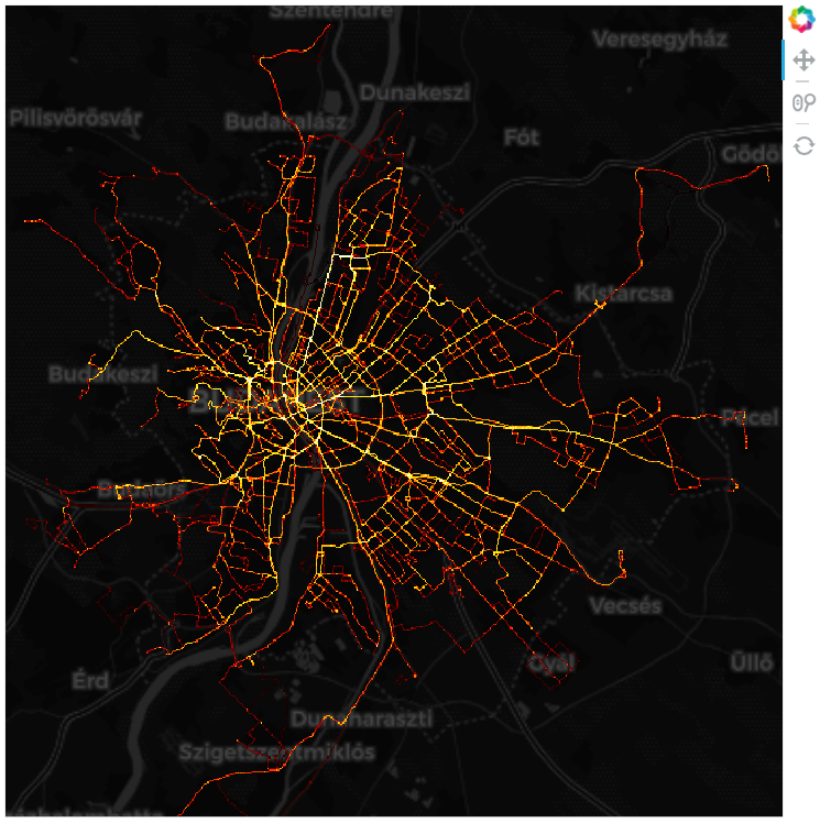
The image you see on this webpage is just a static image due to the limitations of the site engine (or more accurately, my inability to make it work with Bokeh plots), but if you run this example in a notebook, you can pan and zoom interactively. Furthermore, the datashading callback function is run each time, so you get a nicely shaded picture with meaningful colors every time.
Second approach: using GPS data

In the first part we managed to plot the number of vehicles scheduled to pass through each location on a given day. It is informative as it is, but it does not really represent the average number of vehicles at a given location and at a given time. There are multiple reasons for this. Clearly, the schedule is just a plan, and the actual routes and stop times might vary due to delays an unforeseen events. A more subtle reason is that vehicles do not spend the time on a given route evenly. They spend more time where they must go slower, spend time in stops and spend even more time in terminals.
Whether we are interested in the number of vehicles passing or the average number of vehicles at a given location (or alternatively, the probability density of vehicle locations) depends on the question we are trying to answer. For example, if we are analysing the amortization of the road surface, the former metric seems quite useful. On the other hand, if we would like to say something about air pollution, the latter one is the way to go.
To plot the density of vehicle loccations, we need different data: the locations of vehicles during a given day. Furtunately, in addition to publishing the timetables in GTFS format, BKK also track the location of its buses, trolleybuses trams and ferries in real time (sadly, no data on the metro), so that websites and applications like this are possible. We can use it to query tthe location of each active vehicle at a regular interval, and then we can simply make a scatterplot of the resulting (quite sizeable) database. It is exactly what I have done (apart from a five-minute-long internet hiatus), and you can download the data in a zipped csv from here (Google Drive link, might not be up indefinitely).
If you are feeling adventurous, you can also try getting the data for yourself. You can find some details on how to do this at the end of this post.
Let us start by looking at our data!
futar = pd.read_csv('C:/bkkdata/vfl_data.csv', encoding='cp1250')
print(len(futar))
futar.head()
11054989
| Unnamed: 0 | … | lastUpdateTime | licensePlate | location | model | … | vehicleRouteType |
|---|---|---|---|---|---|---|---|
| 0 | … | 1539671351 | LOV870 | {‘lat’: 47.44018, ‘lon’: 19.09628} | VanHool AG318 csuklós autóbusz | … | BUS |
| 1 | … | 1539671354 | V1440 | {‘lat’: 47.483326, ‘lon’: 19.053127} | Ganz csuklós | … | TRAM |
| 2 | … | 1539671350 | V2112 | {‘lat’: 47.469288, ‘lon’: 19.082859} | CAF 9 modulos szerelvény | … | TRAM |
| 3 | … | 1539671351 | V4334 | {‘lat’: 47.443512, ‘lon’: 19.036741} | Tátra T5C5K | … | TRAM |
| 4 | … | 1539671367 | V1442 | {‘lat’: 47.520626, ‘lon’: 19.036764} | Ganz csuklós | … | TRAM |
The only thing we need from here are the coordinates (location), but unfortunately they are in a rather peculiar format: a string that looks like a dictionary. Also, we will need to convert the latitudes and longitudes into Web-Mercator coordinates again. Let us sort these out and make it into a proper dataframe!
lat_lon_df = futar.location.str.split(",", expand=True)
lats = lat_lon_df[0].str.replace("{'lat': ", "").astype(np.float64)
lons = lat_lon_df[1].str.replace(" 'lon': ", "").str.replace('}', '').astype(np.float64)

x_coords, y_coords = lnglat_to_meters(lons, lats)
gps_data = pd.DataFrame({'coord_x': x_coords, 'coord_y': y_coords})
gps_data.head()
| coord_x | coord_y |
|---|---|
| 2.125788e+06 | 6.014221e+06 |
| 2.120984e+06 | 6.021325e+06 |
| 2.124294e+06 | 6.019013e+06 |
| 2.119160e+06 | 6.014769e+06 |
| 2.119163e+06 | 6.027471e+06 |
We are set now, on to the plot! The drill is the same as before, we just replace cvs.line with cvs.points.
p = bp.figure(tools='pan,wheel_zoom,reset',
              plot_width=int(600),
              plot_height=int(600),
              x_range=x_range,
              y_range=y_range)

p.axis.visible = False
p.xgrid.grid_line_color = None
p.ygrid.grid_line_color = None

url = "https://cartodb-basemaps-b.global.ssl.fastly.net/dark_all/{z}/{x}/{y}.png"
tile_renderer = p.add_tile(WMTSTileSource(url=url))
tile_renderer.alpha = 1

def image_callback(x_range, y_range, w, h, color_fn=tf.shade):
    cvs = ds.Canvas(plot_width=w, plot_height=h, x_range=x_range, y_range=y_range)
    agg = cvs.points(gps_data, 'coord_x', 'coord_y', agg=ds.count())
    image = tf.shade(agg, cmap=cc.fire, how='eq_hist')
    return tf.dynspread(image, threshold=0.1, max_px=20)

export_image(image_callback(x_range=x_range, y_range=y_range, w=2000, h=2000),
             filename="BUD_gps_fire", background='black')
InteractiveImage(p, image_callback)
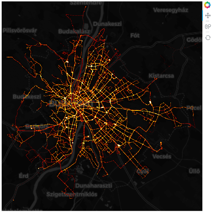
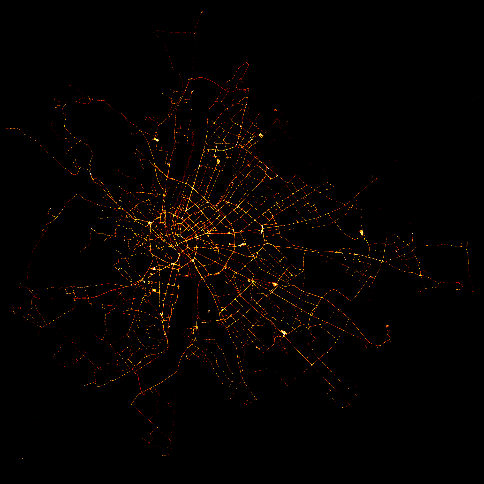
The new image is remarkably similar, but there are a few notable differences. Most notably, there are a number of white hotspots where vehicles seem to spend a lot of time. These are usually terminal stations and large traffic junctions, that did not show up this predominantly on our first picture, but must certainly have a large effect on air quality.
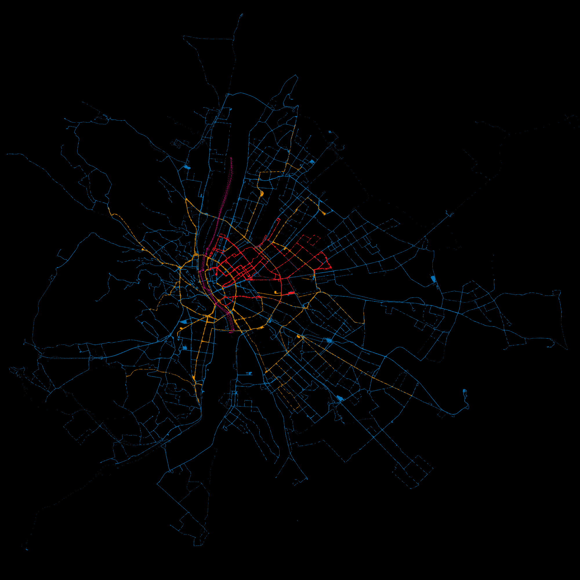
Or do they? Well, that also depends on the vehicle type. Trams and trolleybuses do not really matter in this regard, while regular buses and ferries certainly do. Let’s see how the above picture looks by vehicle type: bus, tram, trolleybus and ferry.
There is not much new stuff going on here: we simply aggregate and shade a dataframe for each type of vehicle, and then merge them using tf.stack. Note, that unfortunately, the stacking order matters for the final picture. Also, as each part is shaded separately, the densities are going to be displayed according to their relative (conditional) densities.
data_bus = gps_data[futar.vehicleRouteType == 'BUS']
data_tram = gps_data[futar.vehicleRouteType == 'TRAM']
data_trolleybus = gps_data[futar.vehicleRouteType == 'TROLLEYBUS']
data_ferry = gps_data[futar.vehicleRouteType == 'FERRY']
futar.vehicleRouteType.value_counts()
BUS           8468914
TRAM          1871667
TROLLEYBUS     698070
FERRY           16338
Name: vehicleRouteType, dtype: int64
p = bp.figure(tools='pan,wheel_zoom,reset',
              plot_width=int(600),
              plot_height=int(600),
              x_range=(2.101e6, 2.155e6),
              y_range=(6012796, 6038876))

p.axis.visible = False
p.xgrid.grid_line_color = None
p.ygrid.grid_line_color = None

url = "https://cartodb-basemaps-b.global.ssl.fastly.net/dark_all/{z}/{x}/{y}.png"
tile_renderer = p.add_tile(WMTSTileSource(url=url))
tile_renderer.alpha = 1

def image_callback(x_range, y_range, w, h, color_fn=tf.shade):
    cvs = ds.Canvas(plot_width=w, plot_height=h, x_range=x_range, y_range=y_range)
    agg_bus = cvs.points(data_bus, 'coord_x', 'coord_y', agg=ds.count())
    agg_tram = cvs.points(data_tram, 'coord_x', 'coord_y', agg=ds.count())
    agg_trolleybus = cvs.points(data_trolleybus, 'coord_x', 'coord_y', agg=ds.count())
    agg_ferry = cvs.points(data_ferry, 'coord_x', 'coord_y', agg=ds.count())
    image_bus = tf.shade(agg_bus, cmap=[(4, 71, 111), (8, 119, 188)], how='eq_hist')
    image_tram = tf.shade(agg_tram, cmap=[(115, 72, 0), (248, 155, 0)], how='eq_hist')
    image_trolleybus = tf.shade(agg_trolleybus, cmap=[(136, 0, 6), (255, 33, 42)], how='eq_hist')
    image_ferry = tf.shade(agg_ferry, cmap=[(112, 0, 67), (214, 0, 128)], how='eq_hist')
    image = tf.stack(image_bus, image_tram, image_trolleybus, image_ferry)
    return tf.dynspread(image, threshold=0.1, max_px=20)

export_image(image_callback(x_range=x_range, y_range=y_range, w=2000, h=2000),
             filename="BUD_gps_by_type", background='black')
InteractiveImage(p, image_callback)
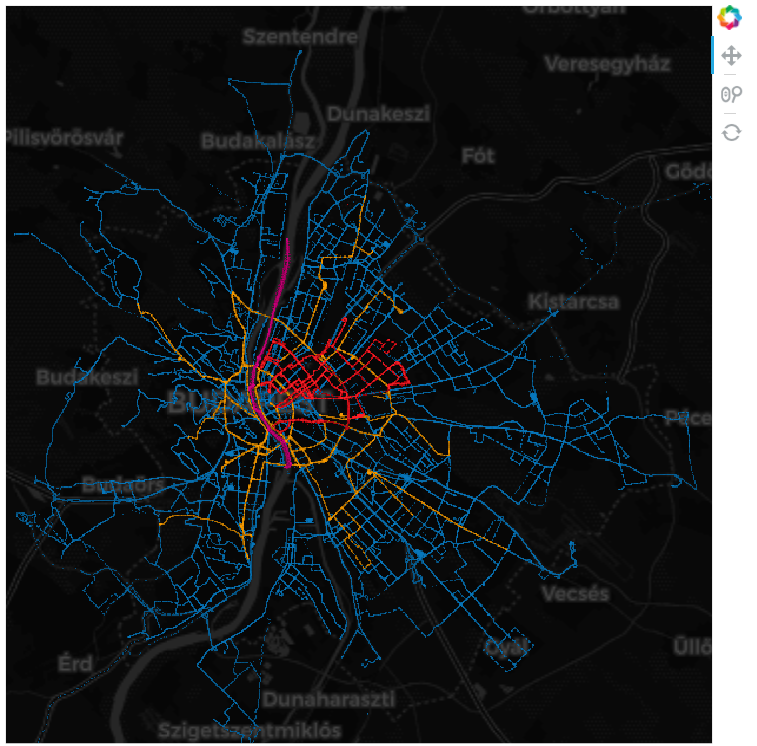
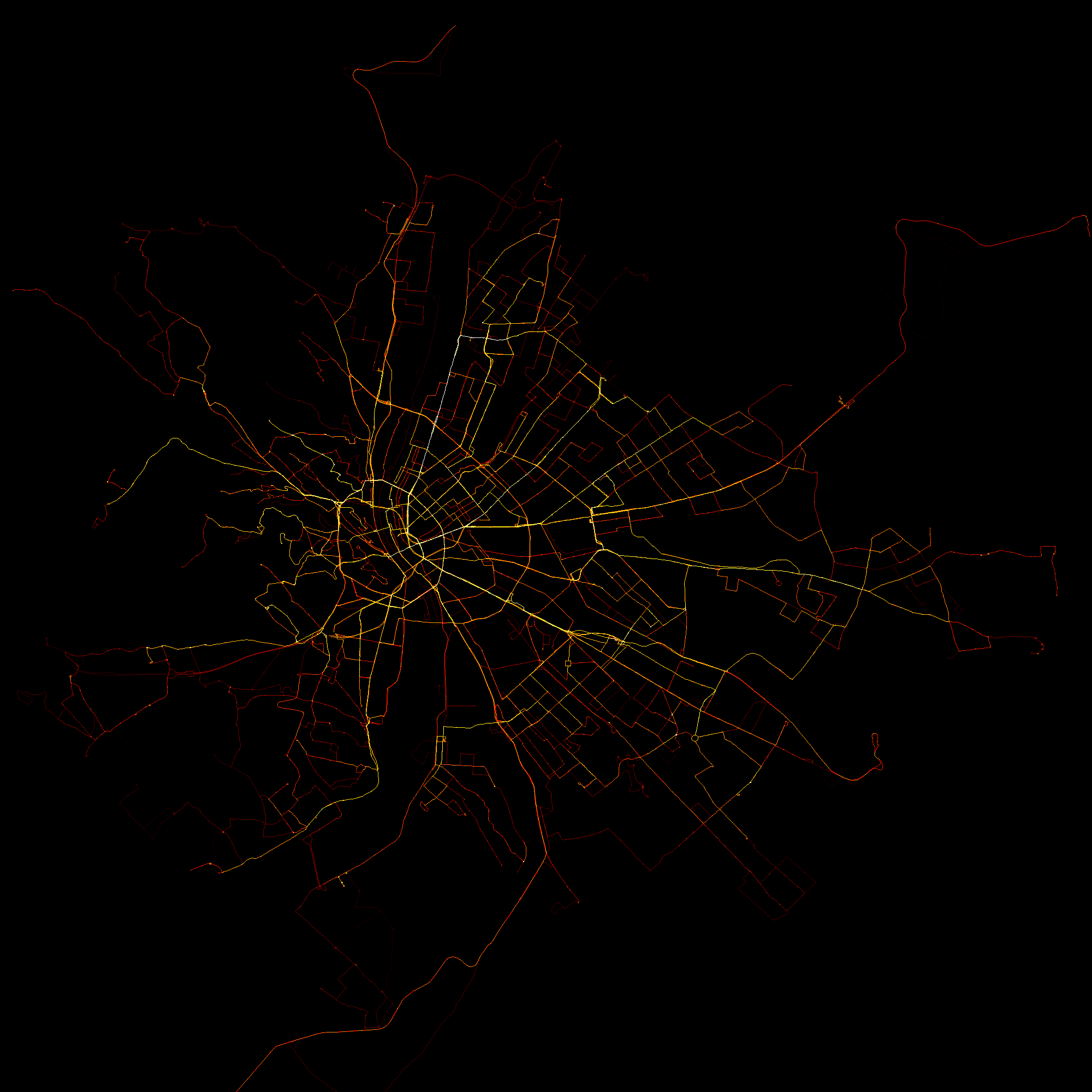
That’s it for this post. Hope it was useful and/or interesting for you. Finally, some high-res versions of the above pictures with no map in the background (right-click and open in new tab to get to full res version):
Happy plotting!
Appendix: getting real-time GPS data
BKK has a surprisingly good API to obtain real-time GPS data, accompanied by the also surprising lack of official documentation. Nevertheless, the following resources proved very useful (alas, they they are only available in hungarian):
The final code that was used to download the data is displayed below withous any further comments. Should be quite self-explanatory.
import os
import requests
import time
import datetime
import pandas as pd

def vehicles_for_location(radius=None,
                          lat_span=None,
                          lon_span=None,
                          lat=47.498412,
                          lon=19.04037,
                          key='test',
                          version=3):

    if lat_span is None and lon_span is None and radius is None:
        raise TypeError("Either radius or lon_span and lat_span must be supplied")

    params = {'lat': lat,
              'lon': lon,
              'key': key,
              'version': version}
    if radius is not None:
        params['radius'] = radius
    else:
        params['latSpan'] = lat_span
        params['lonSpan'] = lon_span

    base_url = "http://futar.bkk.hu/bkk-utvonaltervezo-api/ws/otp/api/where/vehicles-for-location.json"
    req = requests.get(base_url, params=params)
    req.raise_for_status()

    if req.ok:
        print('Successful request at {}'.format(datetime.datetime.now().strftime("%Y-%m-%d %H:%M:%S")))

    return req.json()

def store_vfl(vfl_req, path):

    df = pd.DataFrame(vfl_req['data']['list'])

    if not os.path.isfile(path):
        with open(path, 'w') as file:
                df.to_csv(file, header=True)
    else:
        with open(path, 'a') as file:
            df.to_csv(file, header=False)

def run_scraper(interval,
                run_until,
                path,
                min_interval=2,
                radius=None,
                lat_span=None,
                lon_span=None):

    while datetime.datetime.now() < run_until:
        t0 = time.time()

        try:
            vfl = vehicles_for_location(radius=radius, lat_span=lat_span, lon_span=lon_span)
        except (KeyboardInterrupt, SystemExit):
            raise
        except requests.exceptions.HTTPError as e:
            print('\nUnuccessful request at {}'.format(datetime.datetime.now().strftime("%Y-%m-%d %H:%M:%S")))
        except Exception as e:
            print('\nSomething went wrong at {}'.format(datetime.datetime.now().strftime("%Y-%m-%d %H:%M:%S")))
        store_vfl(vfl, path)

        sleep_time = max(min_interval, t0 + interval - time.time())
        time.sleep(sleep_time)

# if __name__ == "__main__":
    # run_until = datetime.datetime(2018, 10, 12, 22, 10, 00)
    # path = '/bkkdata/vfl_data.csv'
    # run_scraper(10, run_until, path, 100)